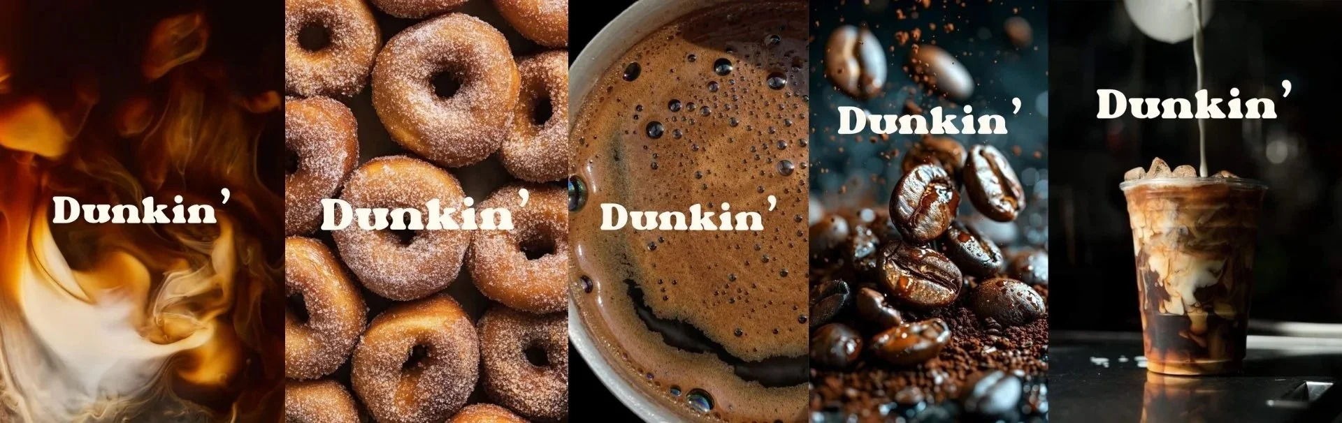
Concept Rebrand · Brand Identity · Packaging
A reimagining of Dunkin' that trades its fast-food visual language for a warmer, more café-led identity. A bold serif wordmark, coffee-inspired neutrals, and restrained applications create a more mature system while preserving the familiarity and accessibility at the center of the brand.
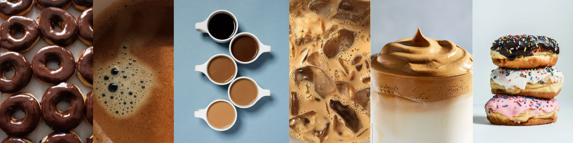
Visual Direction
Identity System